01
Made for Samsung (M4S) was a team within Galaxy Store that created Samsung-specific apps and services in collaboration with external partners.
As a UX Designer and Project Lead from 2015 to 2020, I contributed across product planning, concept development, UX/UI direction, launch preparation, and post-release support.
This portfolio highlights the broader partnership model behind M4S and how design contributed to shaping Samsung specific product experiences.

Created to Extend the Galaxy Ecosystem Beyond Core Features
As the Galaxy ecosystem expanded, Samsung saw an opportunity to offer users more relevant and differentiated experiences beyond built-in system features alone.
M4S was created to identify external services that could be adapted into Samsung-specific offerings—bringing added utility, exclusivity, and ecosystem value to Galaxy users.
My Role
Product Planning
Concept Development
UX Flow Planning
Partner service value interpretation for Galaxy user experiences, Samsung device-based service direction and concept development, feasible UX flow and feature structure planning, design principle, brand, and usability review, development, QA, and launch experience quality management
The Team
Timeline
02

Translating Partner Value into Galaxy User Experience
I helped define how each partnership could deliver value specifically for Galaxy users—not just as a promotion, but as a differentiated product experience. This included identifying opportunity areas, shaping early concepts, and aligning ideas through workshops and partner discussions.

Turning concepts into Samsung product directions
My role was to translate product direction into tangible concepts through mockups, UX strategy, and design guidance from Samsung’s perspective. I also reviewed whether proposed experiences aligned with Samsung’s design principles, brand expectations, and user experience standards.

Supporting launch quality and promotional execution
I stayed involved through launch by coordinating with partners, reviewing end-to-end user flows, addressing QA issues, and supporting promotional deliverables such as store assets, notification surfaces, and editorial materials.
03

Partnership Planning

Concept & App Design

Development Support

Launch & Promotion
From Partnership Opportunity to Launchable Product
Each M4S project followed a structured process—from partnership alignment and opportunity definition to concept planning, development support, QA, and launch preparation.
This workflow helped turn external partnerships into product experiences that were not only marketable, but ready to function within the Galaxy ecosystem.
04
A Broad Partnership Ecosystem Across Categories
M4S collaborated with a wide range of global partners across media, travel, photography, productivity, education, and lifestyle.
These partnerships reflect the breadth of the initiative and the variety of services explored as part of the Galaxy ecosystem. The logos below highlight representative brands involved across different categories.

CNN

TWC

Expeida

Lyft

Amazon Kindle

Photobucket

Pear

TOMO

Toons TV

Shazam

Yelp

News Republic

ABC Mouse

Acrobat Reader

Premiere Rush

Booking.com

Shazam

Shutterfly
05
Turning premium news content into a specific Galaxy experience
Samsung partnered with CNN to create a premium mobile news experience tailored for Galaxy devices, including phones, tablets, and wearables. Rather than simply republishing existing CNN content, the project focused on adapting CNN’s editorial video content into device specific experiences that felt native to Samsung products.
By combining CNN’s curated news storytelling with Samsung’s hardware strengths, such as Edge screen interactions, and wearable interfaces the partnership created a differentiated content experience across multiple Galaxy surfaces.


My Contribution to CNN for Samsung
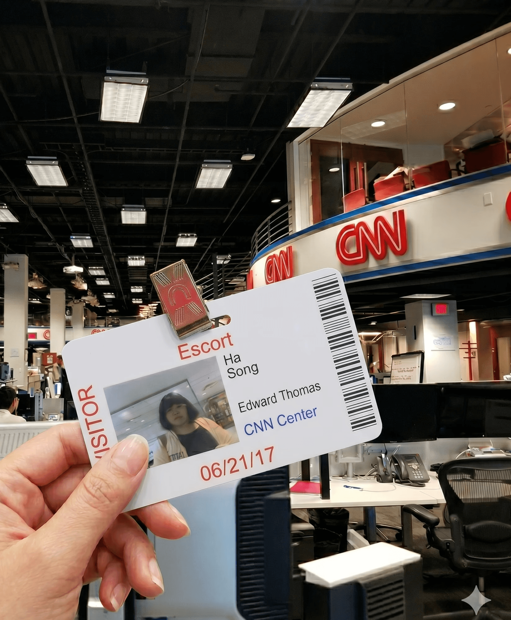
Initial Launch
For the initial launch of CNN for Samsung, the project was focused on upgrading existing CNN content to 1080 HD and expanding the service across more Samsung devices, rather than creating entirely new content. At this stage, my contribution centered on making sure the experience fit within the Samsung ecosystem.
Reviewed whether M4S brand identity was consistently maintained
Checked alignment with Samsung design guidelines
Validated the experience across mobile, Edge Panel, and Gear

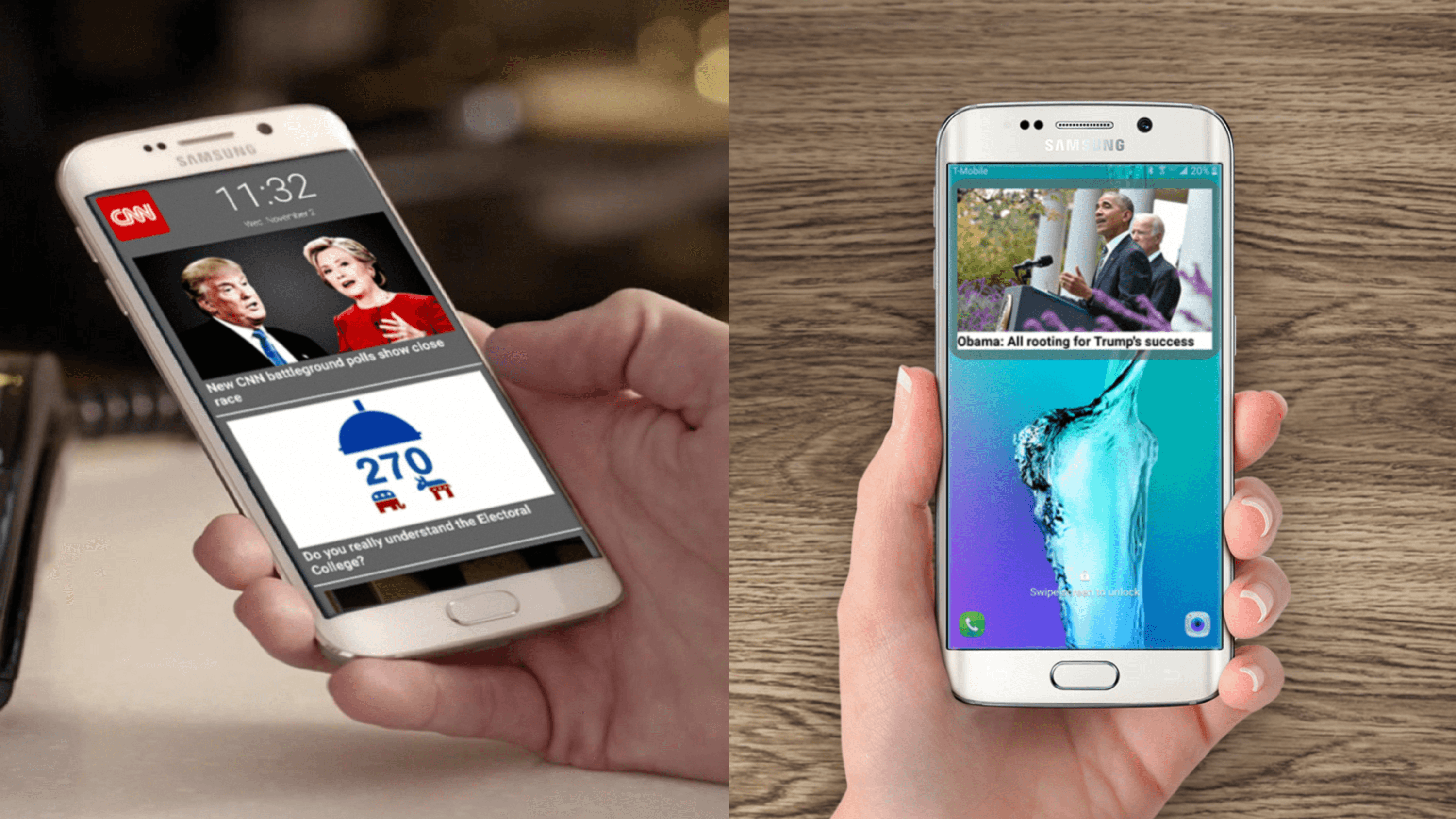
CNN for Samsung Lock Screen
In the following quarter, I took on a more active role in shaping a new service update: CNN for Samsung Lockscreen Content. I proposed the idea of bringing CNN news to the lock screen, based on the nature of news as content that should be delivered immediately and at first glance.
Proposed the lockscreen as a new entry surface for news content
Created the mockups and UI/UX proposal
Designed an in-app on/off setting for lockscreen visibility
Defined an experience where users could view headline highlights and images directly on the lock screen






Product Screens


06
Reimagining weather as a more personal daily experience
TWC for Samsung was more than an adaptation of an existing weather app.
Although The Weather Channel already delivered rich and practical information, the experience remained largely utility-driven, centered on presenting data rather than connecting with users in a more personal and engaging way.
This project explored how weather could be reimagined within the Samsung ecosystem as a more visual, emotionally resonant, and routine-aware experience through specific Samsung themes, illustration-based concepts, and feature ideas such as Smart Alarm.
By combining visual exploration, feature ideation, and user-centered thinking, the project aimed to transform a functional weather service into a more distinctive Galaxy experience.


Original TWC App
The original TWC app felt functional, but emotionally distant
The app delivered weather information clearly, but the experience felt more practical than expressive.
It worked well as a utility, but lacked the visual and emotional quality needed to make weather feel more vivid and relatable.
Backgrounds felt disconnected from the weather
Images often appeared random, loosely related to the actual condition, or were replaced by advertising visuals. This weakened the emotional connection between the interface and the weather itself.
The visual language felt dated
The weather icons were functional, but overly classic in style. As a result, the overall experience felt less fresh and less expressive than it could be.
The layout left room for a richer experience
The main screen focused heavily on the current weather at the center, but did not fully use the layout to surface a broader and more engaging view of weather information.
Illustration Theme Proposal
Using illustration to create a more emotional weather experience
I proposed an illustration-based theme because I believed illustration could bring a warmer and more emotionally resonant quality to the weather experience. Rather than simply showing weather conditions, it offered a way to express atmosphere, mood, and a stronger personal connection.
When I reviewed stock illustrations, I found them limited in conveying the emotional tone I wanted. To communicate the direction more clearly, I personally illustrated sample visuals and shared them with TWC as part of the proposal. Although the process was detailed and time-consuming, I believed it was important to present a more intentional and emotionally expressive visual language.
As both a designer and a weather app user, I wanted the experience to feel not only useful, but also emotionally meaningful. Through this proposal, I explored how illustration could make the app feel more distinctive, personal, and memorable within the Samsung ecosystem.


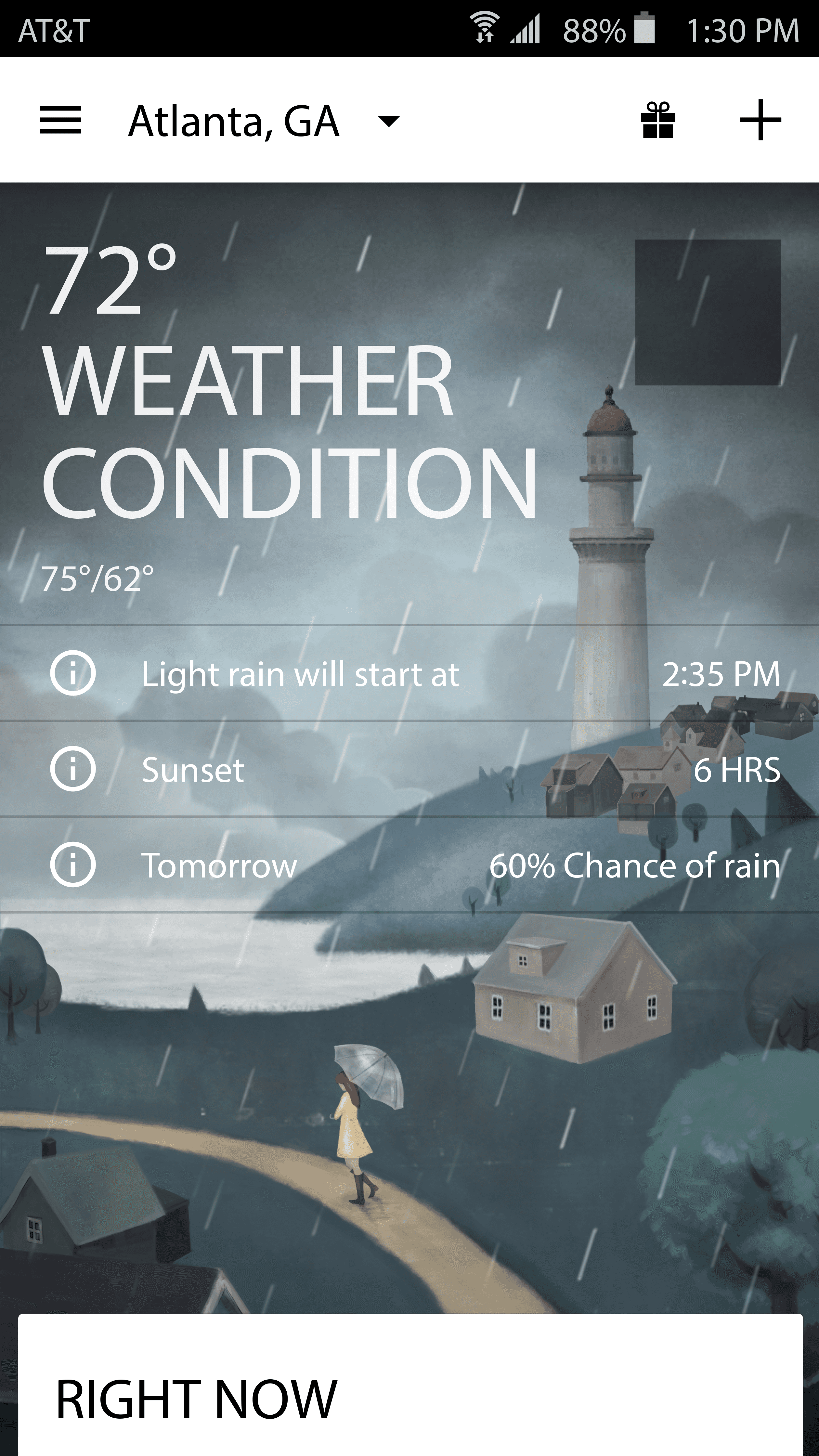


Photo Theme Proposal
Using weather-relevant photography to strengthen visual connection
I also explored a photo-based theme as part of the Samsung Theme direction. Since the original app often used background images that felt unrelated to the actual weather, I proposed a more intentional approach by curating stock photos that better matched each condition. The goal was to make the background feel less random and more supportive of the weather’s mood, creating a more connected and visually engaging experience.


Weather Icon Refresh
Updating the icon language to feel more modern and expressive
As part of the visual refresh, I also looked at the weather icon system. While the original icons were functional and easy to recognize, they felt overly classic and visually dated. Because the project aimed to bring more feeling into the app, I saw the icon language as an important part of shaping a fresher and more expressive experience.
My focus was on exploring how the icon style could better support the overall emotional tone of the product. I wanted the icons to feel clearer, more contemporary, and more aligned with the warmer visual direction proposed for Samsung Theme.














Final Product


My illustration proposal helped shape the final visual update
The final product evolved in line with the illustration-based direction I had proposed earlier in the project. By recognizing the value of bringing more emotion and originality into the weather experience, TWC moved forward with an illustration-led visual update and collaborated with an artist to refresh the weather screens with more distinctive imagery.
This update replaced the previous background treatment with a more creative and expressive visual approach, allowing the app to feel less generic and more emotionally engaging. As a result, the weather experience became not only more visually memorable, but also more aligned with the original goal of bringing more feeling into the product.
In this sense, the final product was meaningful because it showed how my initial proposal contributed to a broader shift in the app’s visual direction — from a functional weather interface to a more unique and emotionally resonant experience.


Creating a Samsung-Exclusive Weather Experience
TWC already had a strong core weather app experience, with reliable forecasts, detailed weather data, and an established brand presence.
For TWC for Samsung, the challenge was not simply to recreate the same weather app under a Samsung partnership. We needed to identify a Samsung-exclusive feature that could add meaningful value to users’ daily lives and make the experience feel more personal, timely, and differentiated.
The opportunity was to move beyond weather as information — and explore how weather could support real-life decisions. To explore new feature opportunities, Samsung and The Weather Company held a collaborative workshop at TWC’s headquarters in Atlanta.
Co-Creation Workshop
Exploring Ideas at TWC HQ
To create a more differentiated experience for TWC for Samsung, we needed to look beyond the standard weather app experience.
At TWC’s headquarters in Atlanta, Samsung and The Weather Company held a collaborative workshop to explore where weather information could create more meaningful value in users’ daily lives.
Instead of starting from a fixed feature list, we began by discussing daily routines, weather-related pain points, and the moments when forecast information becomes most actionable.

Design Thinking Approach
This workshop was my first introduction to a structured design thinking process.
At the time, The Weather Company was part of IBM’s broader technology ecosystem, where Enterprise Design Thinking was used to help multidisciplinary teams align around user needs and turn shared observations into actionable ideas.
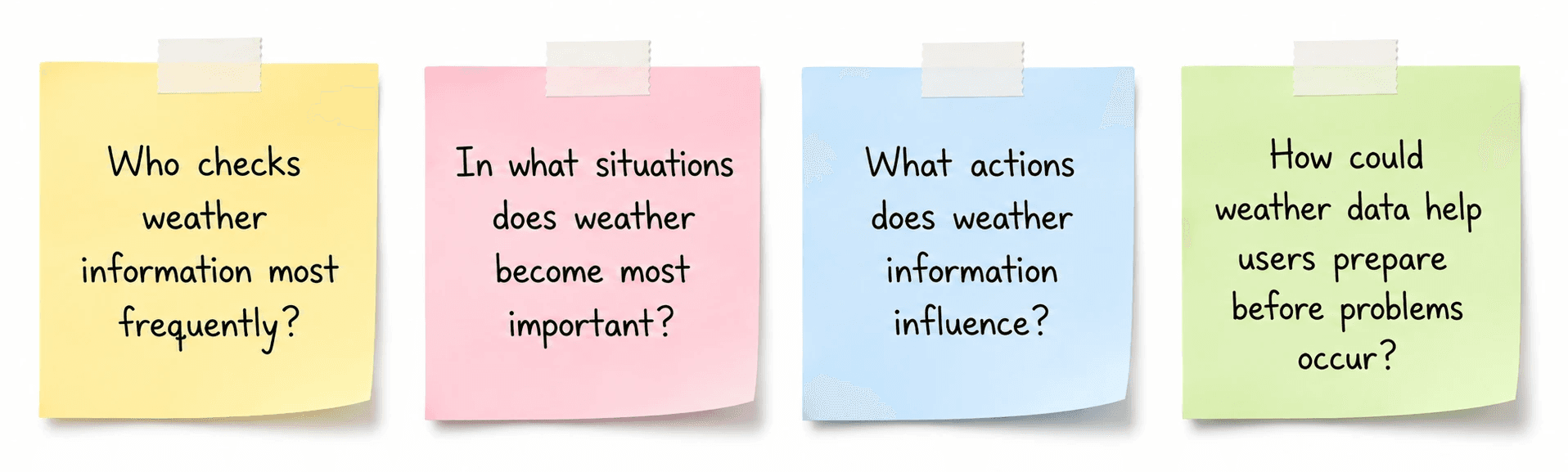
Using this approach, we explored weather not only as forecast data, but as something that influences everyday decisions.
We focused on questions such as:

Weather Matters Most Before the Day Begins
Through the workshop discussion, the team aligned on daily commuters as a more frequent and repeatable use case.
For working adults, weather is part of the morning routine. Rain, snow, icy roads, or extreme temperatures can affect their wake-up time, clothing, commute, and need for extra preparation.
This shifted our focus from people who check weather often to people whose morning decisions are directly affected by weather.
The key problem was timing.
Weather information is most valuable in the morning, but users have the least time and attention then. Even if they check the forecast the night before, they may not adjust their alarm or routine in time.
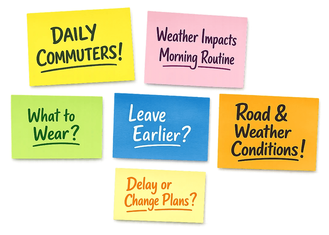
What if weather could adjust the user’s morning before they open the app?
Persona

“Did I check the weather? I really can’t afford to be late again”
Ava has a packed weekday morning and commutes by bus and train. Bad weather can delay her schedule, but she rarely has time to check the weather app while getting ready.
Pain Points
Commute delays from rain, snow, or icy conditions
Last-minute decisions about clothes, umbrella, shoes, or route
Little room for unexpected changes in the morning
Needs
Weather information before her routine begins
Simple, actionable guidance
Alerts that fit into her existing alarm routine

“I checked the forecast last night, but I forgot to change my alarm”
Daniel needs to get his child ready, handle daycare drop-off, and commute to work. Bad weather can slow down traffic and add extra preparation to an already tight morning.
Pain Points
Daycare drop-off takes longer in bad weather
Needs to prepare for both himself and his child
May forget to adjust his wake-up time after checking the forecast
Needs
Advance notice before the morning rush
Reminders to adjust his schedule
Weather guidance connected to real actions
Introducing Smart Alarm
A Weather-Aware Alarm for Commuters
Instead of only waking users at a fixed time, Smart Alarm would consider upcoming weather conditions and help users prepare earlier when the forecast could affect their morning commute.

Weather-Based Trigger
Smart Alarm detects upcoming weather conditions that may affect the user’s morning, such as rain, snow, storms, icy roads, or extreme temperatures.
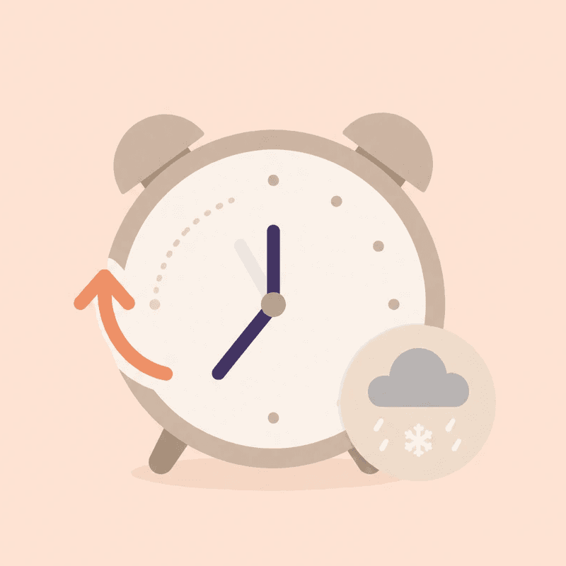
Early Wake-Up Recommendation
When bad weather is expected, the alarm can suggest waking up earlier or notify the user before their regular alarm time.

Morning Weather Glance
When the alarm rings, users can quickly see key weather details and decide whether they need more time, extra preparation, or a commute adjustment.
User Flow
The setup flow was designed to be simple and familiar, using the existing mental model of setting an alarm.
1
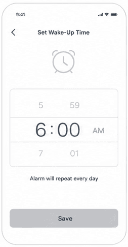
Set Wake-Up Time
2

Select Weather Triggers
3

Choose Early Alert Time

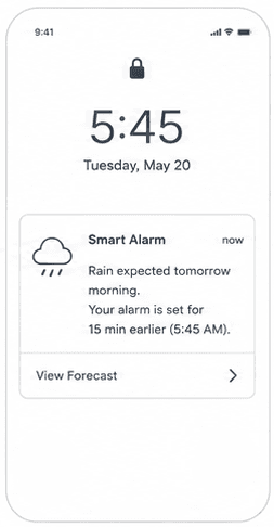

Final Product
A Weather Response Experience Built into a Familiar Alarm Flow
The final Smart Alarm concept fit weather-related choices into a familiar alarm-setting flow. Users only needed to set three things: wake-up time, weather triggers, and early alert timing. Instead of showing a full forecast upfront, the alert focused on the key information needed to make a quick morning decision.
This made Smart Alarm feel lightweight and easy to fit into an existing morning routine.
Familiar Alarm Structure
Uses a standard alarm-setting layout to reduce learning effort.
Weather-Based Conditions
Lets users connect weather events directly to wake-up timing.
Condition-Specific Control
Allows each weather trigger to be turned on or off individually.
Flexible Early Timing
Supports different early wake-up times depending on the weather condition.
Unified Setup
Keeps time, days, weather, sound, and vibration in one screen.

07
Designing the first impression for a Galaxy-exclusive photo experience.
Photobucket for Samsung was a Galaxy-exclusive version of Photobucket, created through the Made for Samsung partnership. The app brought Photobucket’s core photo features into a customized mobile experience for Galaxy users, including cloud photo storage, private album protection, smart gallery organization, photo printing, and exclusive user benefits.
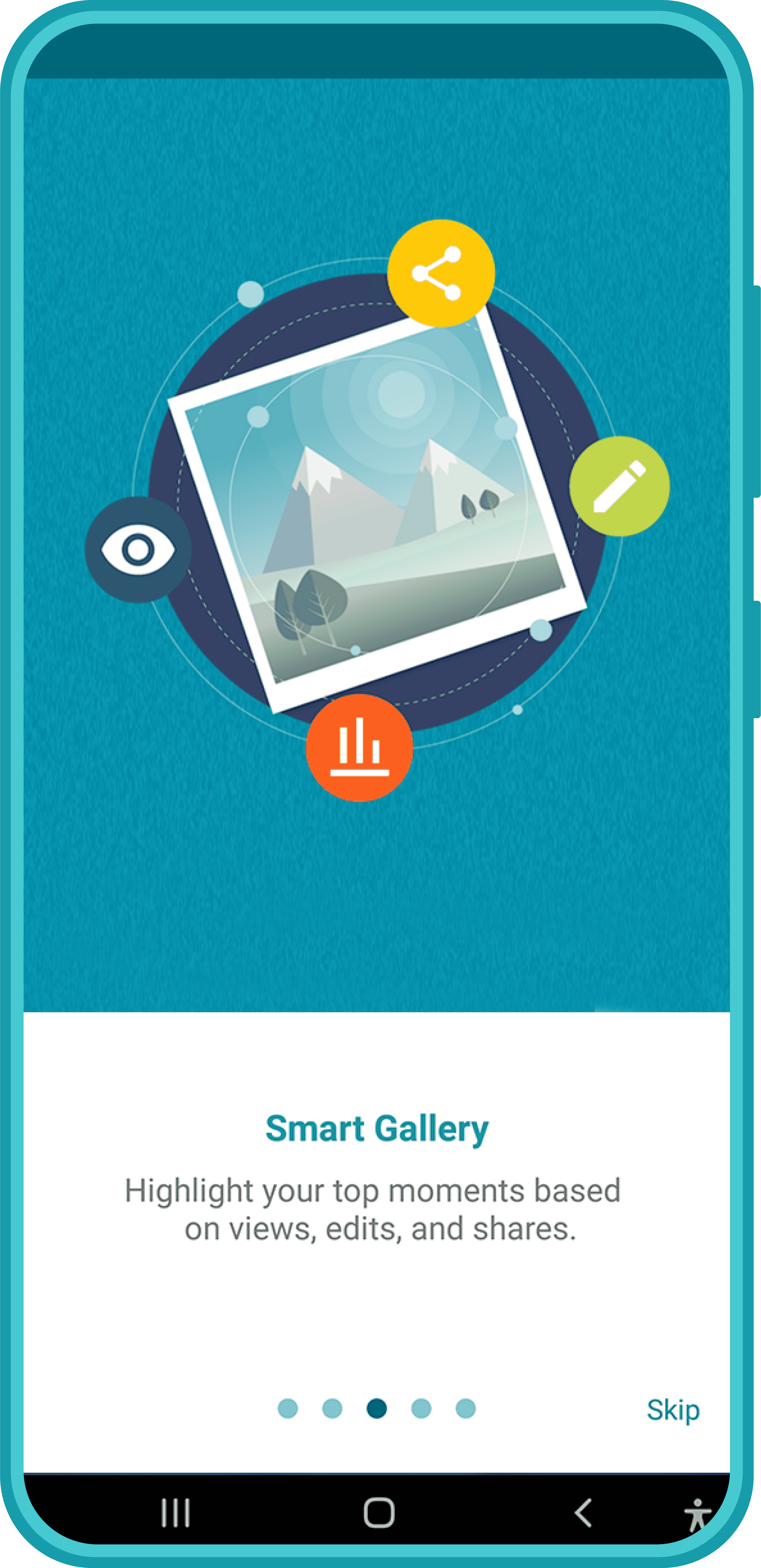
My role focused on designing the onboarding experience — the first interaction users would have with the app. Since the service offered multiple features, the onboarding needed to communicate its value quickly without making the experience feel heavy or overly explanatory.

Simplifying the First Experience
Photobucket for Samsung needed to introduce several values at launch — photo storage, private albums, smart gallery features, photo printing, and Samsung-exclusive offers.
The challenge was to help new users understand these values quickly without making onboarding feel heavy or overly instructional.
To keep the first experience simple, I designed each screen around:
One clear user benefit
A simple visual metaphor
A short title
A brief supporting caption
This structure helped users scan each message quickly while moving through the onboarding flow.
Rather than listing features one by one, the onboarding framed Photobucket for Samsung as a Galaxy-exclusive service for managing, protecting, rediscovering, and extending users’ photos.
Final Product




08
Creating a unified storefront presence for M4S partner apps
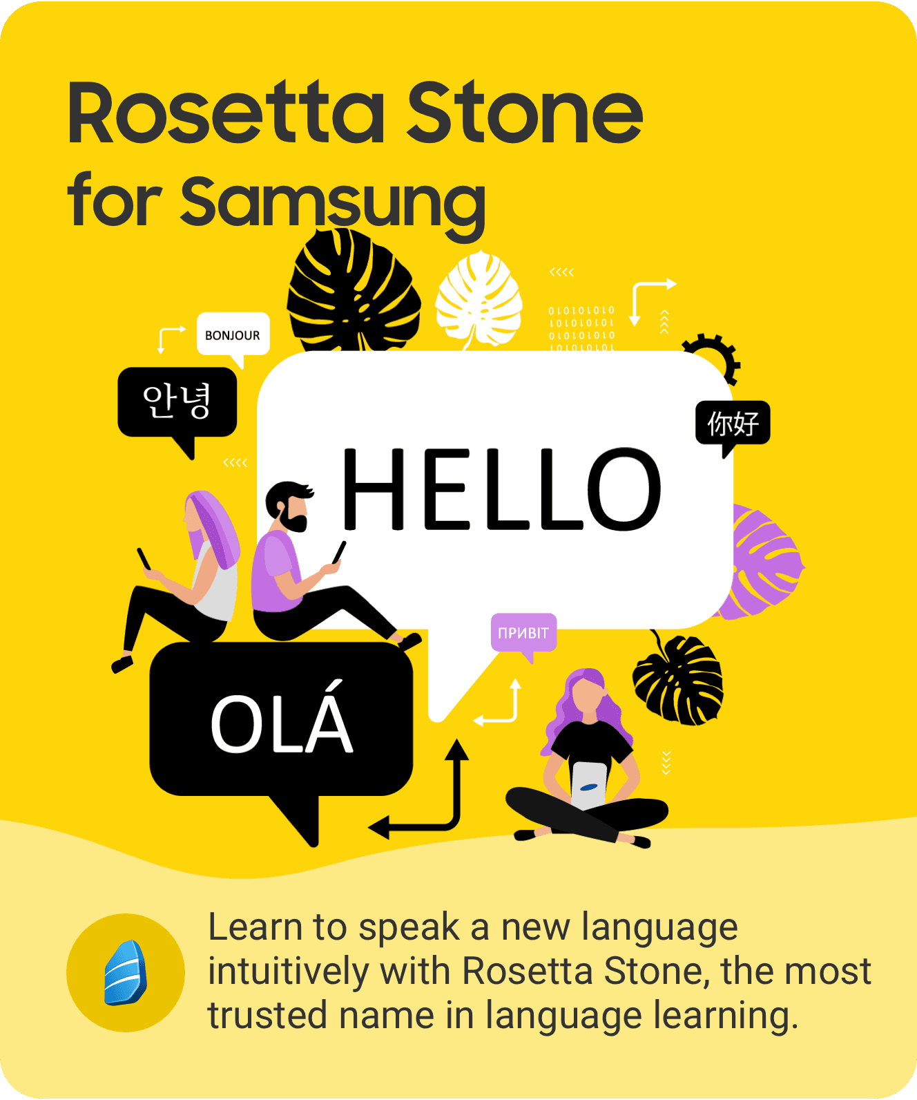
M4S partner apps were featured in the main advertising area at the top of Galaxy Store.
I designed a series of promotional banners that communicated each app’s core value, key benefit, and Samsung-exclusive offer at a glance.
Using a consistent layout structure with app-specific illustrations, colors, and concise copy, the banners helped different partner apps feel connected as part of the same M4S ecosystem.
Designed Galaxy Store promotional banners for multiple M4S partner apps
Created a consistent visual structure across the banner series
Developed app-specific flat illustrations and benefit-driven copy
Maintained visual consistency across different partner brands




09
Made for Samsung, or M4S, was where I began my career as a designer.
When I first joined Samsung right after university, I had a foundational understanding of user-centered design, but I had not yet fully experienced how products are shaped within real business contexts and partner collaborations.
M4S became the starting point that broadened that perspective.
Through working with global partners, I learned that design is not only about creating screens or solving user problems in isolation. To shape a meaningful product experience, I had to consider user needs, partner goals, Samsung’s platform direction, and what could realistically be delivered as a service.
Throughout this process, communication became just as important as design execution.
Understanding each partner’s content, business objectives, and expectations helped me think about how their services could create value for Galaxy users. At times, this meant translating partner ideas into experiences that fit Samsung’s ecosystem. At other times, it meant proposing a more suitable user experience from Samsung’s perspective.
M4S also gave me the opportunity to observe how a service moves from early discussion to launch.
From initial planning and design direction to development collaboration, QA, release, and Galaxy Store promotion, I was able to see how products are built through the alignment of many different stakeholders, decisions, and constraints.
Collaborating with global brands such as CNN, The Weather Channel, and Expedia remains one of the most memorable parts of this experience.
More than the familiarity of those names, what stayed with me was how these collaborations helped me understand the broader role of design. Design can act as a bridge between different goals, helping clarify product direction and shape the experience that eventually reaches users.
Looking back, M4S was not just my first job.
It was an important foundation that helped me understand what kind of designer I wanted to become — one who looks at user experience and business goals together, and uses design to connect the two.