OVERVIEW


M4S Screen was a project that extended Made for Samsung(M4S) content beyond Galaxy Store discovery and brought it directly to the user’s lock screen.
The service organized partner content such as CNN, The Weather Channel, Tubi TV, and Yelp, along with Samsung-created features like To-do List, Photo Album, and Favorite Apps, into a channel-based experience. Users could browse content like TV channels, turn channels on or off, manage their order, and quickly view selected content from the lock screen.
I contributed to this project end-to-end, from early concept discussions and persona definition to app structure, UX/UI design, development handoff, QA, Galaxy Store launch, and promotional assets.
Product Planning
Concept Development
UX/UI Planning
Lock screen service concept definition connecting partner content and Samsung features, key content structure planning for news, weather, video, and local information, lock screen entry, navigation, and settings flow design, onboarding and user flow development, development collaboration, QA, launch preparation, and promotional asset review
Made for Samsung
2018 – Jul 2020
Launched in the U.S.
BACKGROUND
M4S content needed more meaningful user touchpoints
Made for Samsung(M4S) apps offered Galaxy-exclusive content and partner-driven services, but because they were not pre-installed, they were difficult for users to discover naturally.
The main ways users could encounter M4S apps were through Galaxy Store placement or push notifications. However, these touchpoints depended on users actively visiting the store or noticing a temporary promotional message. Even when the content had value, the moments where users could discover it were limited.
This was not only a marketing visibility issue. It was a product experience challenge: how could M4S content become more naturally discoverable and useful within the user’s daily device experience?

OPPORTUNITY
Average Daily
SCREEN TIME
7 hours per day

Average Daily
UNLOCKS
205 times per day
The lock screen offered the earliest touchpoint before opening an app
To address this challenge, the team explored new surfaces where users could encounter M4S content more frequently and naturally. The lock screen stood out as the first screen users see when they pick up their phone, and a place where information can be viewed before opening an app.
The lock screen is not designed for long browsing or complex interactions. However, it can be an effective space for content that is useful at a glance, such as weather, news, to-dos, personal photos, or frequently used apps.
M4S Screen was built around this opportunity. Instead of waiting for users to discover M4S content inside the store, the experience brought lightweight, immediately relevant content to the lock screen, making it part of the user’s everyday mobile routine.
CONCEPT DIRECTION
A lock screen content experience users could browse like TV channels
The core concept of M4S Screen was not simply to collect different content inside one app, but to let users choose and manage what they wanted to see on their lock screen.
To support this idea, the content was organized into “channels.” Similar to the way users turn TV channels on or off and browse through them, each channel functioned as an independent content unit that users could select, control, and rearrange.

Partner content such as CNN, The Weather Channel, Tubi TV, and Yelp, as well as Samsung-created features like To-do List, Photo Album, and Favorite Apps, were each presented as individual channels. Users could discover channels from the Channel Page, add the ones they wanted, and manage visibility and order from My Channel Page.
This direction helped define M4S Screen not as a passive content display, but as a channel-based content experience where users could actively shape their own lock screen.
PERSONA
Understanding who needs content instantly
The personas were used to define which types of content would be valuable enough to appear on the lock screen. Rather than targeting all Galaxy users broadly, we focused on specific moments where users would benefit from seeing content immediately, before opening an app.
Although each persona had a different lifestyle, they shared the same expectation: access to relevant content should feel fast, simple, and effortless.
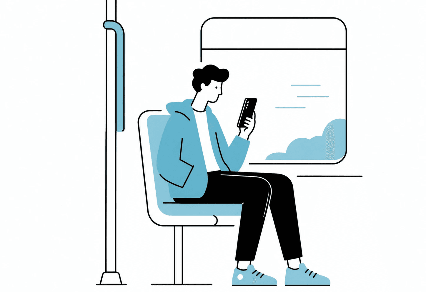
Ethan Miller
28 years
Marketing Associate
“ I just want something quick to watch
without opening another app.”
Behaviors
Watches short videos or quick entertainment content during his commute
Uses his phone in short, fragmented moments throughout the day
Avoids opening multiple apps when he only has a few minutes
Often checks content casually without a specific search intent
Prefers lightweight experiences that do not require setup or commitment
Needs & Goals
Quickly access entertaining content without unlocking and browsing through apps
Discover fresh content during short breaks or commute time
Reduce the friction of switching between multiple entertainment apps
Make idle moments feel more useful or enjoyable
Keep the experience simple, fast, and distraction-free
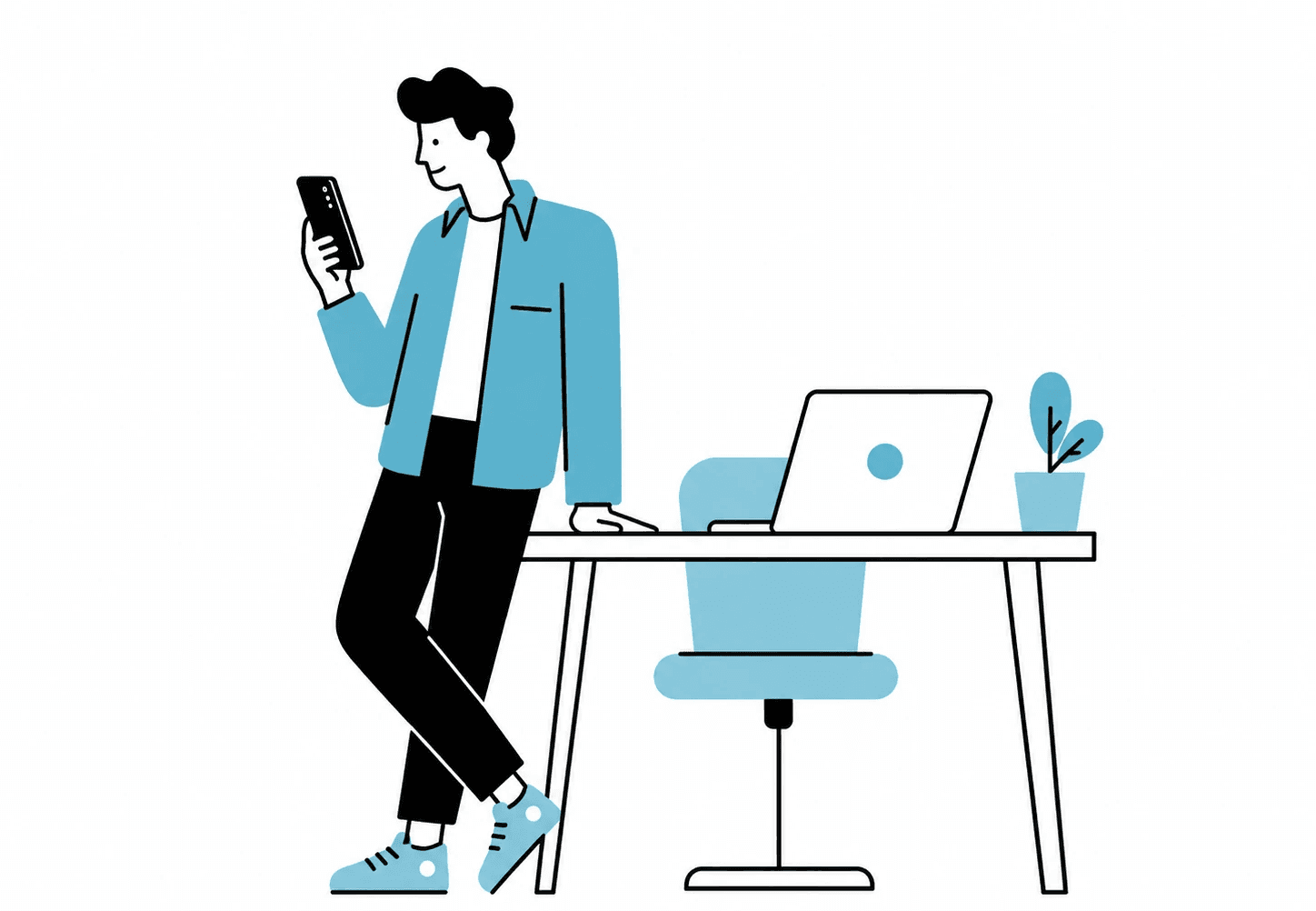
Daniel Carter
34 years
Product Manager
“ I need to stay updated,
but I don’t have time to dig through apps.”
Behaviors
Checks news headlines between meetings or during work breaks
Looks for quick updates rather than reading full articles immediately
Uses food or local recommendation apps when deciding lunch or dinner
Often multitasks and wants information without interrupting his workflow
Prefers concise, reliable, and glanceable content
Needs & Goals
Stay updated on important news without opening a news app
Quickly scan headlines during busy work hours
Access contextual content such as food or local recommendations when needed
Reduce the time spent searching across different apps
Get relevant information in a fast, non-intrusive way

Emily Johnson
38 years
Working Parent
“ I need the important things ready
before I even unlock my phone.”
Needs & Goals
Checks the weather before leaving home with her children
Uses to-do lists to manage shopping, errands, and family tasks
Often needs quick information while carrying bags or multitasking
Looks at personal photos during idle moments or as part of her daily routine
Prefers practical content that helps her prepare and stay organized
Needs & Goals
Check weather information quickly before going outside
Review shopping lists or errands directly from the lock screen
Access useful daily content without searching through apps
Stay organized while moving between home, work, and family tasks
Personalize her lock screen with content that fits her routine
PRODUCT STRUCTURE
A structure for discovering, adding, and managing channels
M4S Screen was not designed as a simple content display on the lock screen. It needed a structure that allowed users to choose and manage which content would appear on their own lock screen.
1
Channel Page

A place to browse available channels
Presented partner content and Samsung-created features as a unified catalog
Served as the entry point for adding new channels
2
My Channel Page

A place to manage added channels
Allowed users to turn each channel on or off
Allowed users to reorder channels shown on the lock screen
3
Edit Mode

Users can hold and drag to reorder channels, defining the exact sequence in which they appear on the lock screen.
Swipe actions reveal management options:
On/Off toggle → Temporarily hide or show channels
Delete button → Permanently remove channels
4
Notification Page
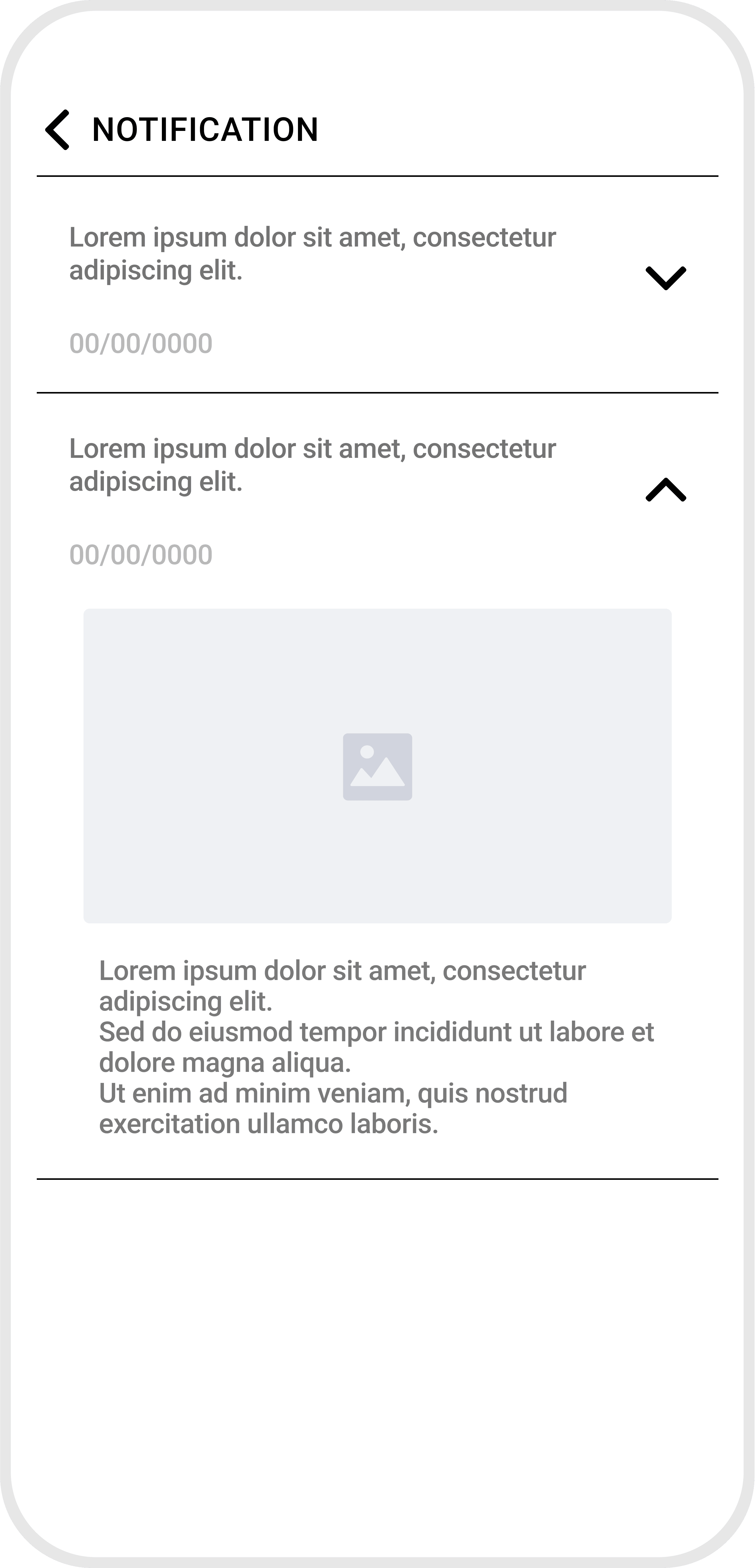
A space for service notices and updates
Supported communication between M4S Screen and users
5
Setting Page

A place to turn the overall M4S Screen service on or off
Included basic settings and FAQ access
6
Lock Screen Display

The final surface where selected channel content appeared
Allowed users to quickly view and swipe through content from the lock screen
M4S SCREEN APP DESIGN
The app functioned as a control hub for shaping the lock screen experience, not as the primary place where content was consumed.
The goal was not to make users learn a new system, but to help them find, add, and manage channels through familiar mobile patterns. The app functioned as a clear management tool that supported the lock screen experience, rather than competing with it.


LOCK SCREEN DESIGN
CNN - NEWS CHANNEL

User Moment
When users want to catch up on major headlines during short breaks, commute time, or before starting the day
Content Value
Provides timely awareness without requiring users to open a full news app
Helps users quickly understand what is happening through short, reliable updates
Design Direction
Reduce the full news browsing experience into one focused editorial preview
Prioritize a featured image, headline, and short summary
Keep text limited so users can scan the story at a glance
Use a clear editorial hierarchy where the image draws attention first, followed by the headline and source information
LOCK SCREEN DESIGN
TWC - WEATHER CHANNEL

User Moment
When users need to check the weather before leaving home, commuting, or adjusting their daily routine
Content Value
Helps users prepare for the day quickly
Provides immediate awareness of current weather conditions and short-term forecast changes
Design Direction
Focus on instant recognition rather than detailed weather exploration
Prioritize current condition, temperature, location, and a short forecast preview
Use strong weather visuals and clear numeric information to make the status immediately understandable
Keep the layout simple enough to support quick decisions such as what to wear or whether to leave earlier
LOCK SCREEN DESIGN
TUBI - VIDEO CHANNEL

User Moment
When users have short idle moments and want something quick to watch or discover
Content Value
Offers lightweight entertainment discovery without requiring users to open a video app first
Helps users find something to watch with minimal browsing effort
Design Direction
Avoid turning the lock screen into a full video library
Highlight one featured video, preview, or continue-watching item instead of showing too many thumbnails
Use a large visual thumbnail, title, and simple play affordance
Keep the interaction lightweight so the channel feels like a quick entry point, not a full media browsing page
LOCK SCREEN DESIGN
YELP - FOOD CHANNEL

User Moment
When users are deciding what to eat during lunch, dinner, or while moving around a local area
Content Value
Supports quick local decision-making
Helps users discover nearby food options without searching through a full recommendation app
Design Direction
Translate restaurant discovery into a compact decision card
Show one nearby recommendation with a photo, rating, distance, and open status
Remove long review content and detailed browsing elements from the lock screen view
Design the layout around fast comparison and immediate usefulness rather than deep exploration
LOCK SCREEN DESIGN
FRVR - GAME CHANNEL

User Moment
When users want a quick game during waiting time, commute moments, or short breaks
Content Value
Provides short-session entertainment
Creates a quick entry point into casual games without requiring deep app navigation
Design Direction
Treat the channel as a quick-play entry point rather than a full game catalog
Feature one casual game or a small set of quick-play recommendations
Use colorful game thumbnails and a clear play action
Limit the number of options to keep the experience light and suitable for the lock screen
LOCK SCREEN DESIGN
PHOTO CHANNEL

User Moment
When users want a quick game during waiting time, commute moments, or short breaks
Content Value
Adds emotional personalization to the lock screen
Allows users to make the first screen they see feel more personal and familiar
Design Direction
Shift from information delivery to emotional connection
Use a large image-focused layout with minimal interface elements
Show selected album photos as a lightweight rotating frame
Let the photo carry the experience while keeping controls and text secondary
LOCK SCREEN DESIGN
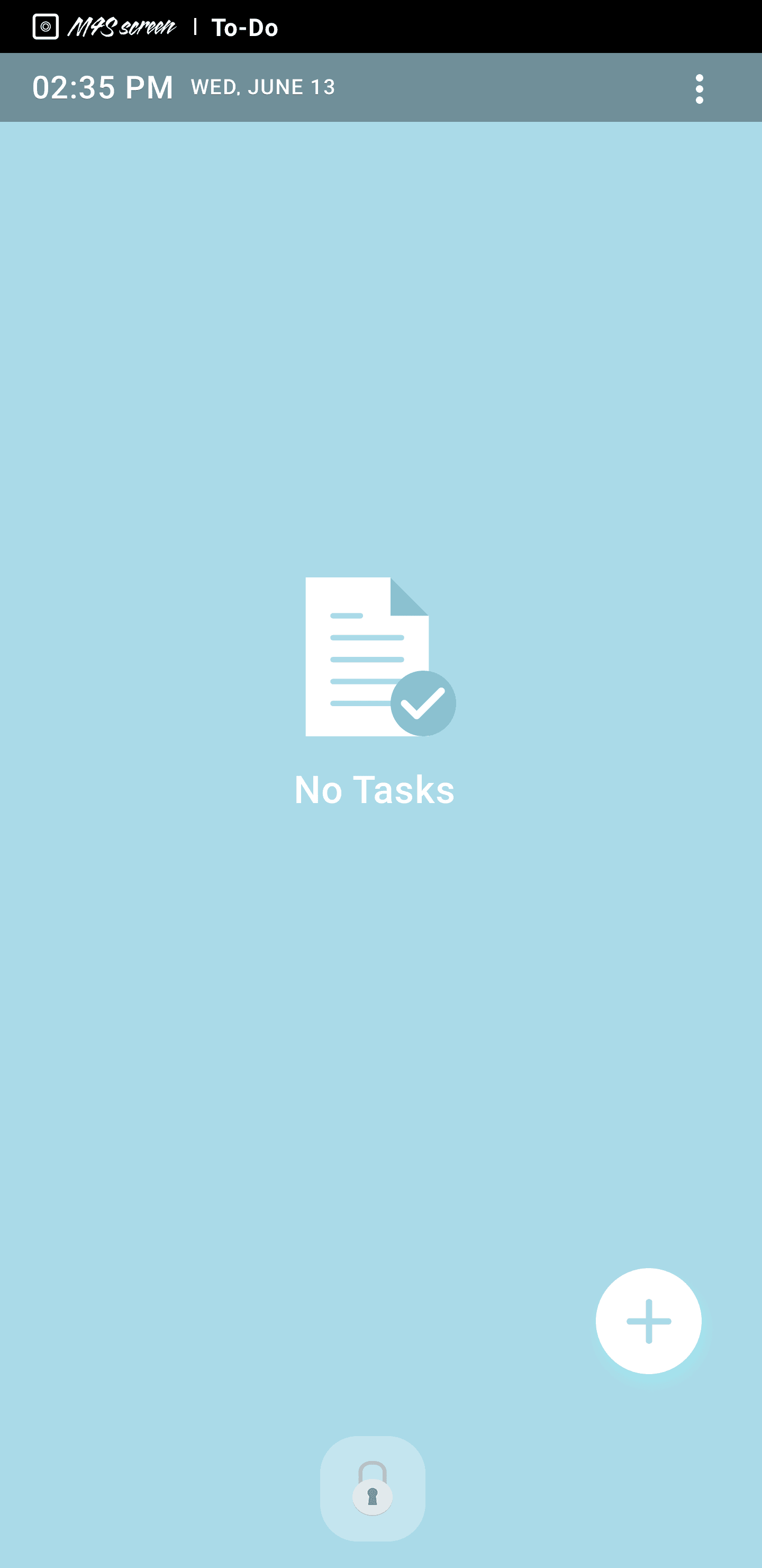
TO-DO LIST CHANNEL

User Moment
When users need to check tasks while leaving home, shopping, commuting, or moving between routines
Content Value
Keeps important daily tasks visible at the right moment
Helps users remember what they need to do without opening a productivity app
Design Direction
Present only a small number of today’s most relevant tasks
Use a simple checklist format with clear spacing and readable text
Prioritize viewing and remembering over editing
Keep the visual style calm and minimal so the task list feels useful rather than overwhelming


LOCK SCREEN DESIGN
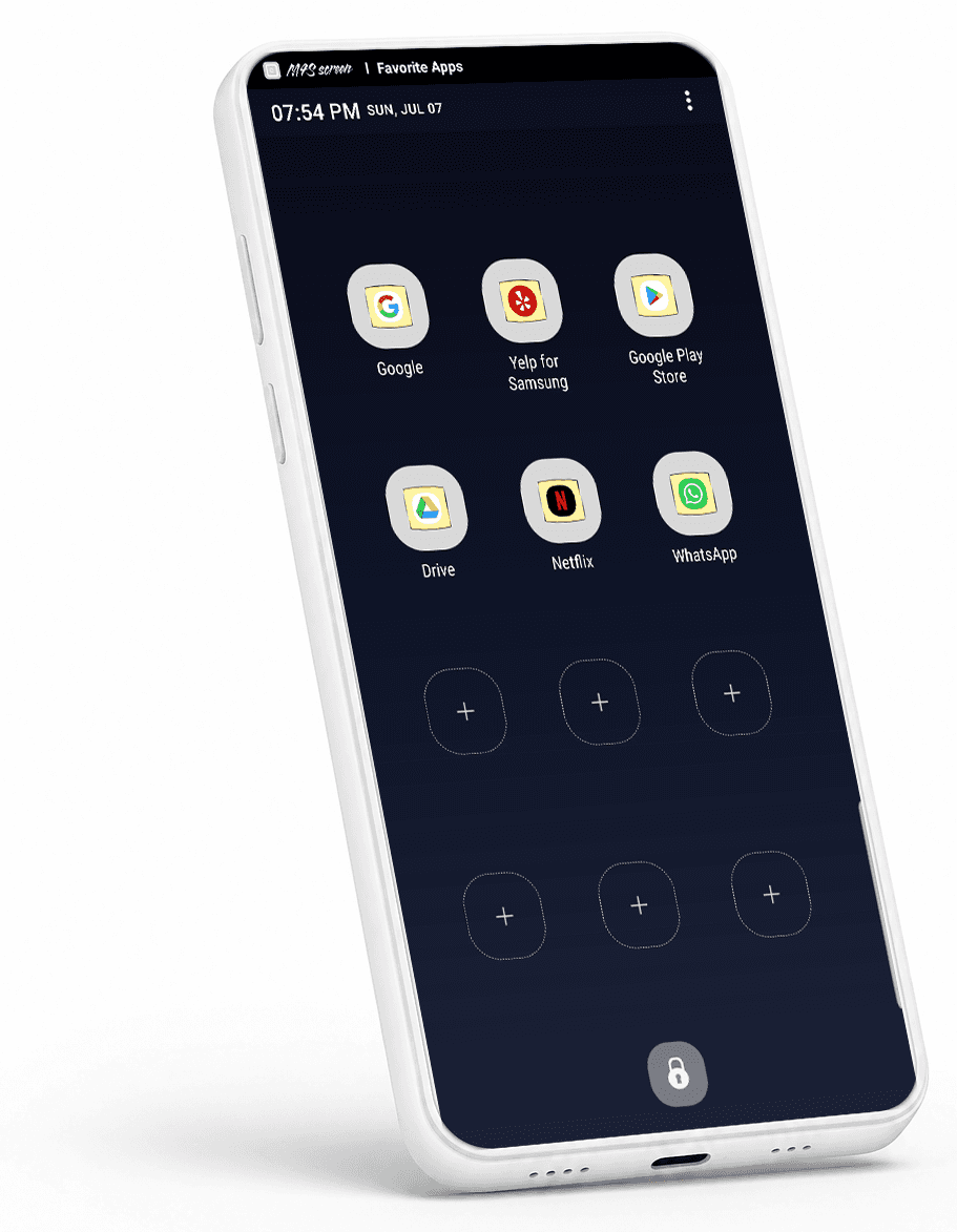
BOOKMARK CHANNEL
User Moment
When users repeatedly open the same apps throughout the day and want faster access
Content Value
Reduces access friction for frequently used apps
Adds a utility layer to the channel system beyond content consumption
Design Direction
Present selected app shortcuts in a simple, limited icon grid
Avoid making the screen feel like a second home screen
Use clear spacing and minimal decoration to reduce visual clutter
Position the channel as quick access utility rather than a content feed
ONBOARDING DESIGN
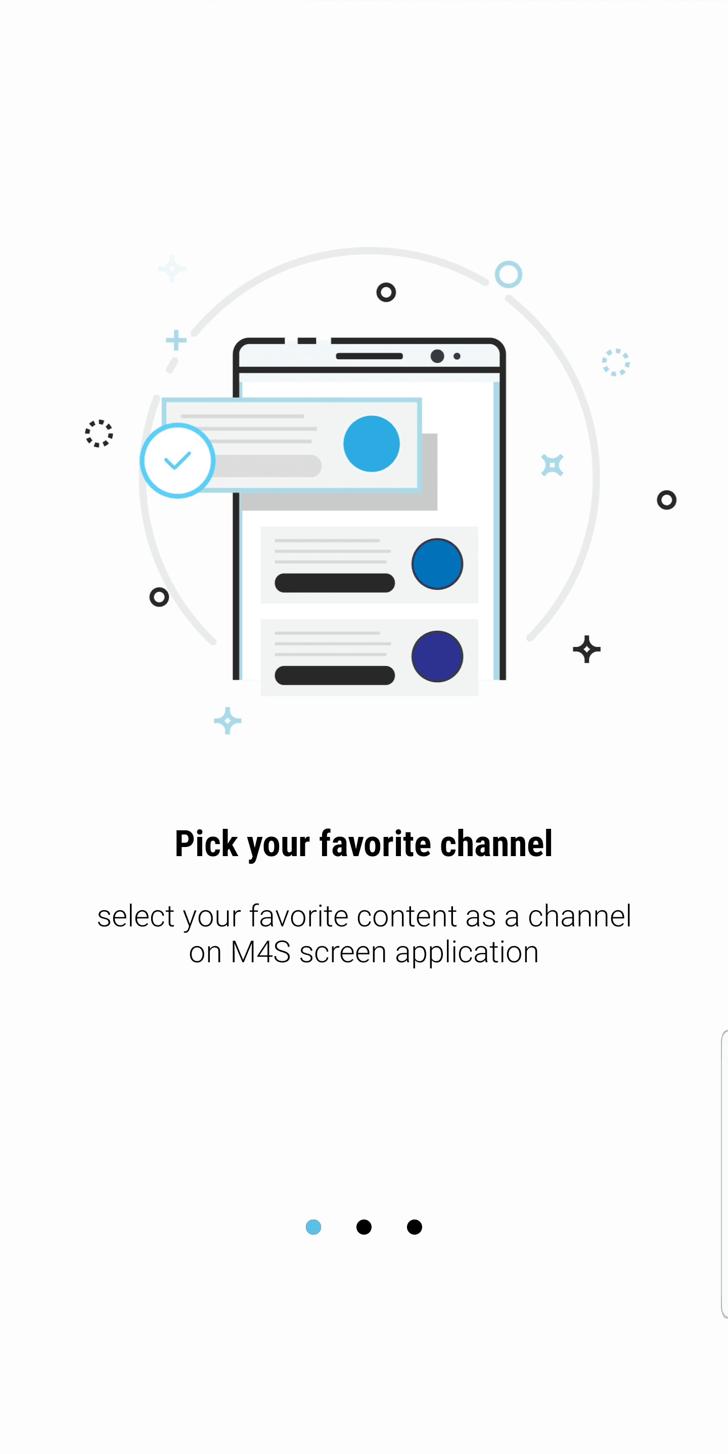
Guiding first-time users with simple, glanceable messages
The onboarding was designed as a short first-use guide that helps users understand what they can do before entering the app. Each screen focused on one key action — choosing channels, viewing daily content, and opening related apps — so users could quickly grasp the experience without reading long instructions.
To keep the flow lightweight, I used minimal illustrations, short headlines, and concise captions. The visual structure stayed consistent across all three screens, allowing users to scan, swipe, and move into the app without friction.


REFLECTION
M4S Screen was my first end-to-end product experience, where I contributed from early concept development to UX/UI design, QA, Galaxy Store launch, and promotional assets.
Through this project, I learned that bringing a product to life requires more than designing screens. It means shaping rough ideas into a clear structure, communicating design intent with developers and partners, making trade-offs during implementation, and staying responsible for the product until launch.
Designing for the lock screen also expanded how I think about user touchpoints. It showed me that even a familiar and often overlooked space can become a meaningful part of the user experience when the content, context, and interaction are carefully considered.
This project helped me understand design as a full product-making process — one that connects user value, business needs, technical execution, and real-world launch.